
Menu
Integrating Color Psychology into Home Decor Choices
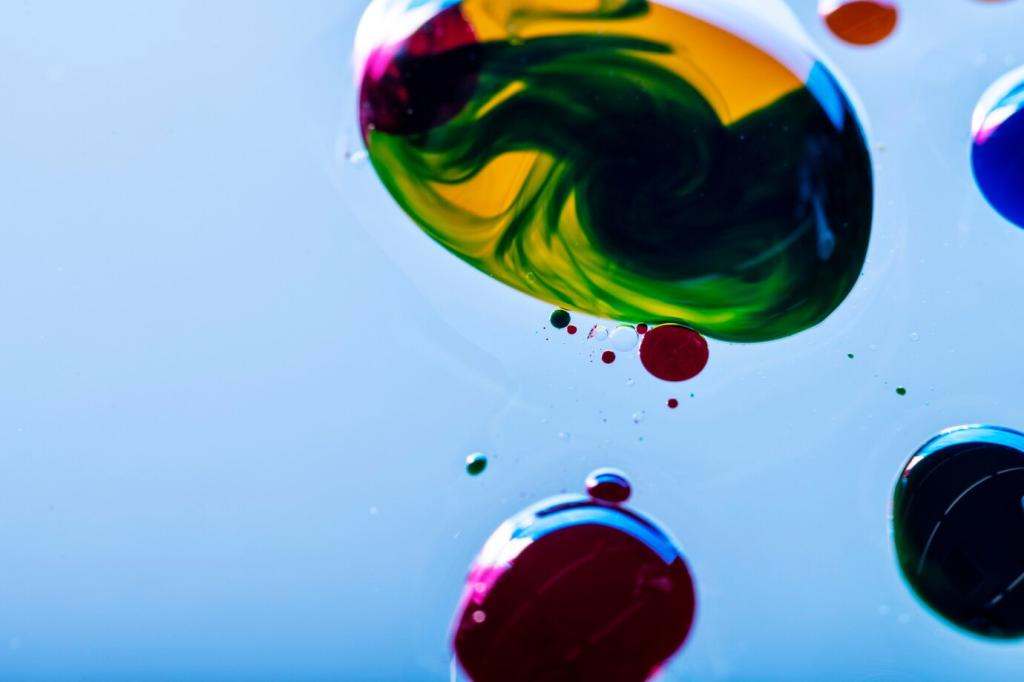
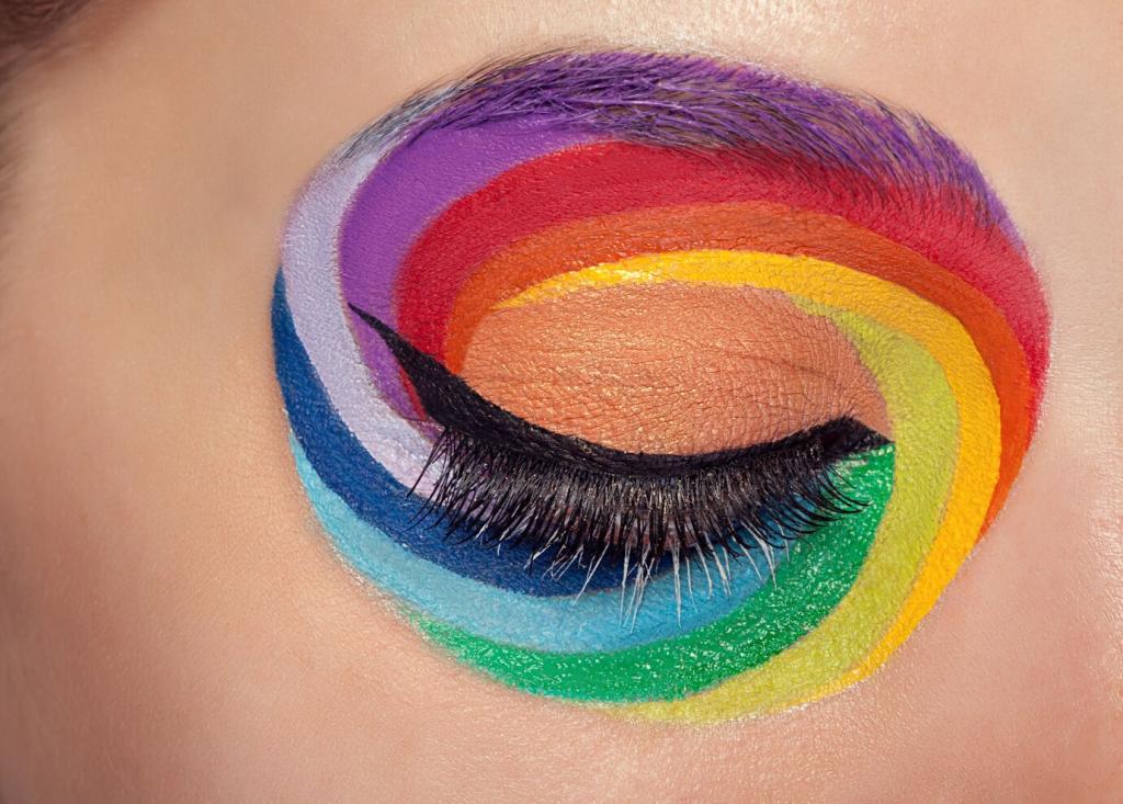
Color is more than a mere visual experience; it shapes our moods, influences daily habits, and sets the emotional tone of our most personal spaces. When thoughtfully integrated into home decor, color psychology empowers us to design interiors that not only reflect our personalities but also nurture our well-being. This guide explores how the theories of color psychology intersect with practical home decor decisions, ensuring that every shade in your living environment supports your comfort, focus, relaxation, and happiness.
Understanding Color Psychology and Its Impact on Mood
01
Warm colors like red, orange, and yellow emanate lively, inviting energies that can positively stimulate mood and conversation. Incorporating these shades in social spaces like living rooms or dining areas brings a sense of warmth and vibrancy, encouraging connection and engagement among guests. However, their intensity also means careful balancing is needed to prevent over-stimulation. Used thoughtfully, warm colors energize a home without overwhelming the senses, sparking joy and optimism in communal spaces.
02
Cool tones such as blue, green, and violet tend to evoke sensations of serenity and calm. These hues are particularly suited for restful areas like bedrooms, meditation nooks, or reading corners. Cool colors are known to lower blood pressure and slow heart rates, fostering peace and relaxation. Their understated presence helps create an atmosphere ideal for unwinding after a long day, demonstrating how scientific insights can genuinely contribute to mental well-being in home environments.
03
Neutrals such as beige, gray, white, and taupe are often chosen for their versatility, yet their psychological effect extends beyond adaptability. They provide a backdrop that grounds other color choices, offering stability and tranquility. Neutrals are especially effective in creating open, airy feels or in supporting minimalist aesthetics. Their subtlety allows for easy updating with accent colors while always ensuring a harmonious foundation that promotes comfort and balance.
Choosing Colors for Different Rooms
01
Energizing Living Areas
Living rooms and family spaces benefit from colors that foster interaction and liveliness. Warm shades or certain stimulating cool tones like turquoise can invigorate social settings without feeling overpowering. By integrating these colors through accent walls, upholstery, or art, the space becomes more dynamic and engaging, supporting the gathering and collaborative activities that define communal areas. This approach ensures the heart of the home is always inviting.
02
Creating Restful Bedrooms
Bedrooms function as sanctuaries, where the primary desire is rest and recuperation. Soft, cool hues like sky blue, sage green, or lavender can help lower anxiety and encourage restful sleep. Even shades of muted pink or taupe can provide comfort without becoming distracting. Using these colors for bedding, wall paints, or window treatments provides a gentle cocoon effect, making the bedroom a haven that soothes the mind and body.
03
Inspiring Productivity in Workspaces
Home offices and study spaces require a delicate balance between calm and stimulation. Colors such as muted green, subtle yellows, or smoky blues promote focus and mental clarity. Avoiding overly vibrant or gloomy tones is key to sustaining productivity. By weaving these shades into wall colors, décor, or even office accessories, a workspace can gently boost concentration while reducing stress, allowing creativity and efficiency to flourish within a thoughtfully colored environment.
Color preferences are deeply personal, often influenced by memories, experiences, and cultural backgrounds. Some may find joy in bold, contrasting palettes while others seek comfort in muted, monochromatic schemes. Honoring your authentic taste is crucial—forcing yourself into a palette that feels unnatural can hinder the sense of belonging and relaxation that a home provides. Allowing individuality to guide choices results in decor that not only looks stylish but also sustains a strong emotional connection.

Households composed of multiple people, including children or elderly family members, need to consider varying needs and sensitivities. Children might thrive in playful, colorful spaces that spark imagination, whereas older adults may appreciate calming, restful shades. Pets, too, can influence choices, such as opting for durable paint finishes or washable textiles. Balancing these various preferences ensures every resident experiences comfort and happiness in shared and private spaces alike.

Lifestyle factors—such as hobbies, work routines, and entertaining styles—should also direct color decisions. Busy households might prioritize easily maintained surfaces in forgiving shades, while frequent hosts could opt for vibrant, sociable environments. Artistic individuals may wish to create inspiring corners with lively hues, whereas minimalists might prefer a pared-down, tranquil palette. Tailoring colors to support daily life ensures the environment feels both functional and emotionally supportive in routine as well as special moments.