
Menu
Understanding Color Psychology in Interior Design
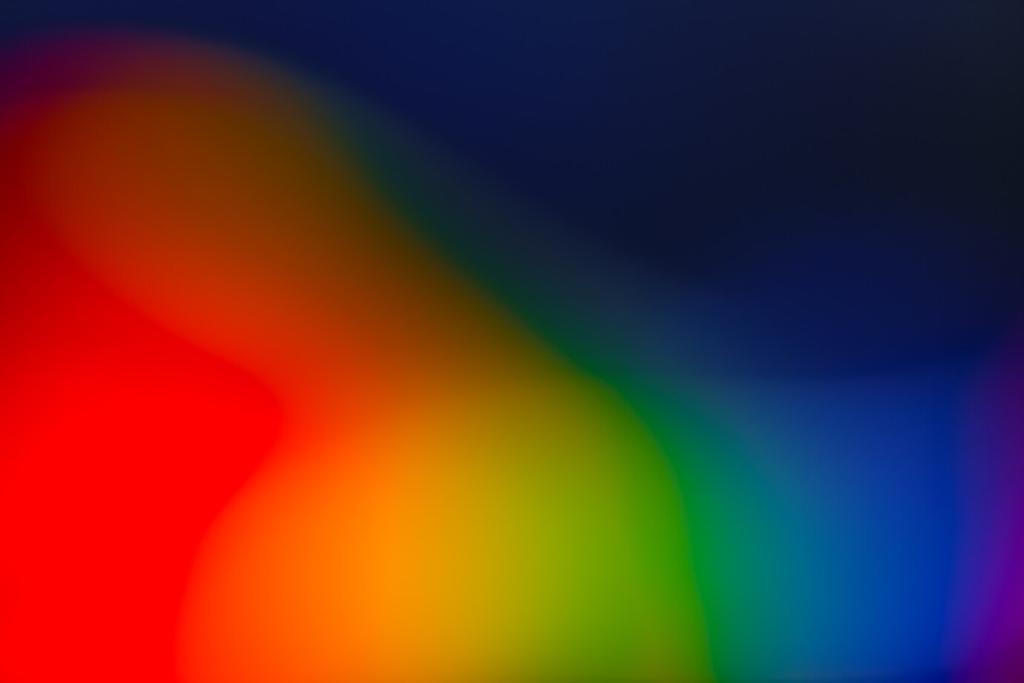
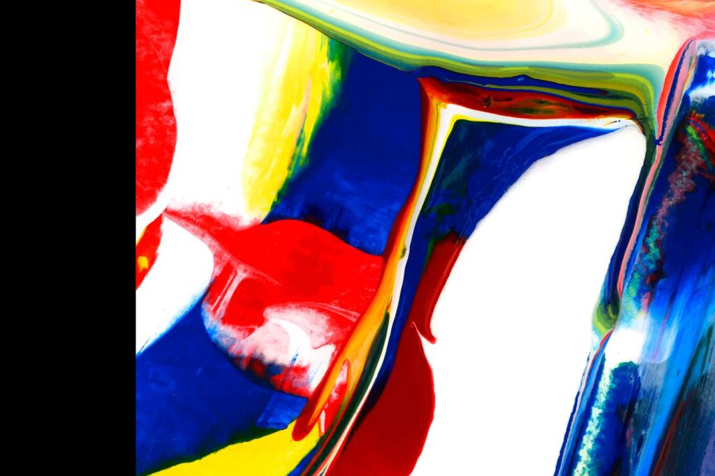
Color psychology is a foundational element in interior design, shaping not only the visual appeal of a space but also influencing mood, perception, and overall well-being. By understanding how different hues and shades affect human emotions and behavior, designers can craft interiors that enhance comfort, productivity, and harmony. From tranquil blues to energizing yellows, each color carries its own psychological effects and associations. Whether aiming to make a statement or cultivate serenity, the strategic use of color enables interiors to become more than just a visual experience—they become powerful, transformative environments molded by thoughtful design choices.
The Science of Color Perception
How the Human Eye Processes Color
When light—comprised of various wavelengths—strikes an object, specific wavelengths are absorbed while others are reflected. Our eyes capture this reflected light, and the retina processes it into electrical signals. These signals travel to the brain, which then interprets them as distinct colors. Understanding this biological pathway is crucial for interior designers, as it helps explain why lighting conditions can dramatically alter color perception within a room. A paint swatch that appears vibrant in natural daylight might look subdued under fluorescent lighting. This knowledge empowers designers to carefully consider lighting during color selection, ensuring the intended mood and effect are consistently achieved throughout the day.
Emotional Responses to Color
Emotional responses to color stem from both inherent reactions—possibly hardwired through evolution—and learned experiences shaped by culture and individual memory. Certain colors evoke immediate feelings; for instance, warm hues like red can stimulate excitement and energy, while cool tones such as blue foster calmness and tranquility. In interior design, harnessing these emotional triggers allows designers to curate atmospheres tailored to specific uses or desired moods. A spa, for example, might lean toward soothing greens and blues, while a dynamic office environment may benefit from strategic pops of invigorating color to boost creativity and alertness.
Cultural Influences on Color Perception
Cultural background has a significant influence on how colors are perceived and interpreted. While white may signify purity and peace in some cultures, it can symbolize mourning in others. Red often represents luck and celebration in Eastern societies, yet it may denote danger or passion in Western contexts. In global interior design, acknowledging these cultural variations is essential, especially for spaces catering to a diverse audience. By considering cultural associations, designers can avoid unintended faux pas and create environments that feel universally welcoming and meaningful.
Red is a color often linked with passion, excitement, and even aggression. Its bold presence makes it a popular choice for social areas like living rooms or dining spaces where lively conversation is encouraged. However, it can also raise heart rates and blood pressure, so restraint and balance are key. When used thoughtfully, red infuses a sense of drama and vitality, commanding attention and making a strong design statement without overwhelming. Designers sometimes employ it in accent pieces or feature walls, allowing its effects to be felt without dominating the space.
The Psychological Effects of Warm Colors
The Power of Cool Colors in Creating Calm
Blue: Tranquility and Trust
Blue is perhaps the most universally favored color, appreciated for its evocation of calm, trust, and stability. Light blues mimic the serenity of a clear sky or calm sea, encouraging relaxation and introspection. Deep blues convey authority and security, making them suitable for both restful retreats and productive workspaces. Designers leverage blue’s versatility to instill different moods in various spaces, always mindful of its potential to create a chilly or distant feeling if overused in large, unbalanced quantities.
Green: Balance and Renewal
Green sits at the center of the color spectrum, symbolizing balance, renewal, and harmony. Tied closely to nature, green naturally relaxes the mind and reduces stress. It is highly adaptable, lending itself well to both common areas and private sanctuaries. The use of green can refresh and invigorate, particularly when combined with natural light and organic textures. In interior design, varying shades from soft sage to vibrant emerald help define the intended ambiance—whether it be restful or revitalizing—drawing on the innate restorative power of the natural world.
Purple: Luxury and Creativity
Purple is a powerful color associated with luxury, creativity, and spirituality. It blends the stability of blue with the energy of red, resulting in a complex, nuanced effect. Light lavenders promote tranquility and relaxation, while deeper shades like plum or eggplant suggest opulence and drama. Purple’s historical use by royalty and aristocracy continues to influence its reputation in modern interiors, making it a popular choice for spaces where sophistication and a touch of mystery are desired. Creative professionals often favor purple in workspaces for its supposed ability to inspire innovative thinking.
Accent Colors and Emotional Focal Points
Choosing the Right Accent Color
Selecting the perfect accent color involves analyzing both the room’s primary color scheme and its functional requirements. For example, a study may benefit from a stimulating contrast, such as a vibrant orange chair against a backdrop of cool blues, to boost creativity and focus. In a bedroom, a deep indigo accent can promote relaxation without detracting from a restful ambiance. Successful accent colors add vibrancy and character, steering mood and energy in nuanced ways while emphasizing the space’s most attractive features without creating discord.
Placement and Balance of Accents
The placement and intensity of accent colors greatly influence the overall harmony of a room. Designers often use accents in moderation, reserving their impact for carefully chosen areas such as throw pillows, artwork, or a statement wall. This strategic deployment ensures the accent doesn’t overwhelm but rather enhances the core palette, creating a visually engaging focal point. Balance is essential, as overcrowding with too many statement shades can disrupt the intended atmosphere and make the space feel chaotic instead of cohesive.
Psychological Impact of Accent Colors
Accent colors are powerful psychological tools, capable of shifting the mood and energy of a space with minimal intervention. A burst of yellow in a neutral living room can energize and uplift, while a splash of teal in a workspace can foster clarity and concentration. Because accents are changeable and relatively inexpensive, they afford flexibility for experimenting with color psychology without a long-term commitment. This makes them ideal for seasonal updates or evolving personal tastes, allowing residents to continuously refine the emotional tone of their environment.
Designing for Function with Color
In offices and study areas, colors that enhance concentration and productivity are key. Cool blues and greens are often favored for their calming effects, which help reduce stress and mental fatigue. However, touches of yellow or orange can also be integrated for short bursts of energy and creativity, particularly in collaborative zones. The balance of tranquility and stimulation ensures that users remain engaged and focused, while gentle accents prevent sterility and contribute to a more inviting work environment.
Spaces dedicated to social interaction—like dining rooms, living rooms, and entertainment areas—benefit from colors that encourage conversation and connection. Warm hues, such as shades of red, orange, and golden yellow, can make guests feel welcomed and foster a lively atmosphere. Strategic color combinations can even influence appetite and perception of taste, which is why reds and golds are common in restaurants. By tailoring the palette to the space’s purpose, designers can boost sociability while setting a comfortable, informal tone.
For bedrooms, bathrooms, and lounge areas, the priority shifts to fostering rest and relaxation. Soft blues, muted greens, and gentle lavenders create a sanctuary from daily stress, inviting serenity and deep rest. Conversely, overly bright or intense colors can be distracting and counterproductive to achieving peace. Texture, lighting, and layering of similar tones play crucial roles in amplifying the restorative effects of these colors, resulting in spaces that soothe both mind and body.
Color Combinations and Harmony
An understanding of the color wheel and relationships—such as analogous, complementary, and triadic schemes—is central to creating balanced palettes. Analogous colors, which sit side by side on the wheel, provide a harmonious and subtle effect, suited for tranquil environments. Complementary schemes introduce contrast, injecting energy but requiring careful management to avoid visual tension. Triadic arrangements offer vibrancy and complexity, ideal for making a memorable design statement. Mastery of these relationships enables both bold creativity and refined restraint in color selection.
Start with Your Desired Mood
Before selecting colors, consider the mood you wish to evoke in each room. Do you want an energizing kitchen, a calming bedroom, or an inspiring home office? Once the desired emotional response is clear, align your palette accordingly. Warm tones spark conversation and create coziness, while cool hues instill peace and reflection. Personal preference should guide these choices, ensuring that the colors surrounding you feel not just right aesthetically, but also emotionally nourishing.
Experiment with Samples and Lighting
Color can change dramatically depending on both time of day and type of lighting. Testing paint and textile samples on site and observing them under various conditions is crucial before making final decisions. This process helps reveal undertones, intensity, and harmony with existing décor. It also uncovers how the color interacts with natural and artificial light, ensuring the finished space maintains the desired effect throughout the day. A little patience at this stage prevents costly and disappointing outcomes later.
Embrace Flexibility and Evolution
Your color preferences may evolve with life changes, seasons, or shifts in personal taste. Embrace this flexibility by incorporating changeable elements—such as throw pillows, rugs, and artwork—allowing you to refresh your palette without large-scale renovations. Staying open to new combinations and regularly updating small details keeps your interiors feeling current, vibrant, and authentically aligned with who you are. In this way, color psychology remains a dynamic, ever-adapting part of your home’s ongoing transformation.