Menu
How Color Influences Mood and Space Perception
Color is a powerful design element that can transform how we feel and perceive our surroundings. Both in interior design and branding, the thoughtful use of color impacts emotional responses and alters the way we interpret space. This page explores the fascinating ways color influences mood and perception, guiding design choices that enhance well-being and functionality.

The Psychology of Color
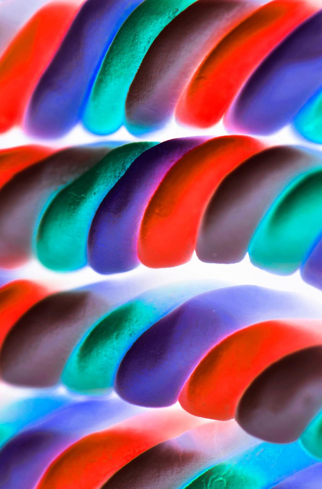
Warm colors like reds, oranges, and yellows are associated with energy and enthusiasm. These hues tend to stimulate the senses, raising pulse rates and evoking feelings ranging from excitement to warmth, but sometimes also anxiety. Spaces decorated with predominantly warm tones can feel cozy and intimate or highly stimulating. For example, a room painted in a deep red may feel inviting and passionate, but could also risk overwhelming the senses if used excessively. The psychological impact of these shades is often leveraged in spaces meant for social interaction or heightened energy, such as kitchens or entertainment areas.
Light Colors Create Spaciousness
Light shades, such as whites, creams, and soft pastels, are frequently used to make small spaces appear larger and more airy. They reflect more light, enhancing the sense of openness and amplifying natural illumination. In compact flats or rooms with limited windows, a pale color palette can work wonders to banish a cramped feeling. When combined with thoughtful lighting, light hues can dramatically transform a tight area into one that feels expansive and inviting, making them a favorite solution in urban interior design.
Dark Colors for Coziness and Depth
Dark tones, including deep blues, greens, and charcoals, create a sense of intimacy and sophistication. Rather than making a space feel smaller in a negative way, these hues can design a cocooning effect that feels luxurious and personal. Designers often use dark walls in spacious rooms to draw them in, making them cozier and less cavernous. The depth offered by dark colors can add drama and focus, especially when contrasted with lighter accents. This approach is ideal for creating statement spaces or private retreats within a home or office.
Accent Colors as Spatial Tools
Accent colors—used on a single wall, ceiling, or architectural element—can guide the eye and manipulate perceived space. A brightly colored feature wall can elongate a room or delineate functional zones, while a vibrant stripe may direct movement through a corridor. Colors placed strategically alter how boundaries and proportions are interpreted, helping to define or obscure areas without the need for structural changes. Through experimentation with accent colors, designers lend flexibility and personality to interiors, tailoring the sense of space to specific needs.
Cultural and Personal Color Associations
Cultural Symbolism and Interpretation
Many societies attach specific meanings to colors, which can deeply impact mood and behavior in different environments. For example, while white represents purity and peace in Western contexts, it is associated with mourning in parts of Asia. Red may bring thoughts of luck in China but caution or danger in Western road signs. These varied associations mean that a color scheme effective in one region may not succeed, or could even cause discomfort, in another. Designers working internationally must research and respect these symbolic interpretations in their color choices.